STA 141B Course Page blog and personal introduction
Two Data Visualization Question about San Francisco
These two interesting questions come from STA141B assignment. This assignment was done using Python sqlite3, basemap, matplotlib and pandas. You may learn other questions in this assignment from this link.
Question 1: Which part of San Francisco is Most Dangerous (and what time)?
Data Description and Processing
The dataset crime was collected from sql database “sf_data.sqlite” SF openData. It contains crime case dating back to August 2015. It recorded case number, category, description, time, district, resolution, address, longitude and latitude.
The datasets is imported into pandas dataframe from sql using.
import pandas as pd
from matplotlib import pyplot as plt
import sqlalchemy as sqla
import sqlite3
%matplotlib inline
plt.style.use('ggplot')

from mpl_toolkits.basemap import Basemap
import scipy.stats as ss
import numpy as np
from matplotlib.patches import Circle, Wedge, Polygon
from matplotlib.colors import LinearSegmentedColormap
conn0 = sqlite3.connect('sf_data.sqlite')
Crime = pd.read_sql_query("select * from crime",conn0)
Data Visualization and Conclusion
First I created a basemap function for San Francisco, and the city is divided by neighbors from shapefile “SFFindNeighborhoods”. The shapefile is available here
def draw_sf(width=2e7,proj='merc'):
    figsize = [10,10]; dpi=80
    fig = plt.figure(1, figsize = figsize, dpi = dpi)
    ax = fig.add_subplot(111)
    bmap = Basemap(width=width,height=width,projection=proj,
                   llcrnrlon=-122.53,llcrnrlat=37.67,urcrnrlon=-122.33,urcrnrlat=37.85,
                   resolution='h', #f for full
                   lat_0 = 37.5,
                   lon_0=-122.5)
    bmap.drawcoastlines()
    bmap.drawmapboundary(fill_color='white')
    #bmap.fillcontinents(color='white',lake_color='white')
    bmap.readshapefile('geo_export_772ba198-1646-427d-8190-94c324b75364','SFFindNeighborhoods')
    return ax, fig, bmap
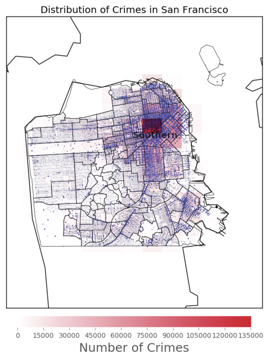
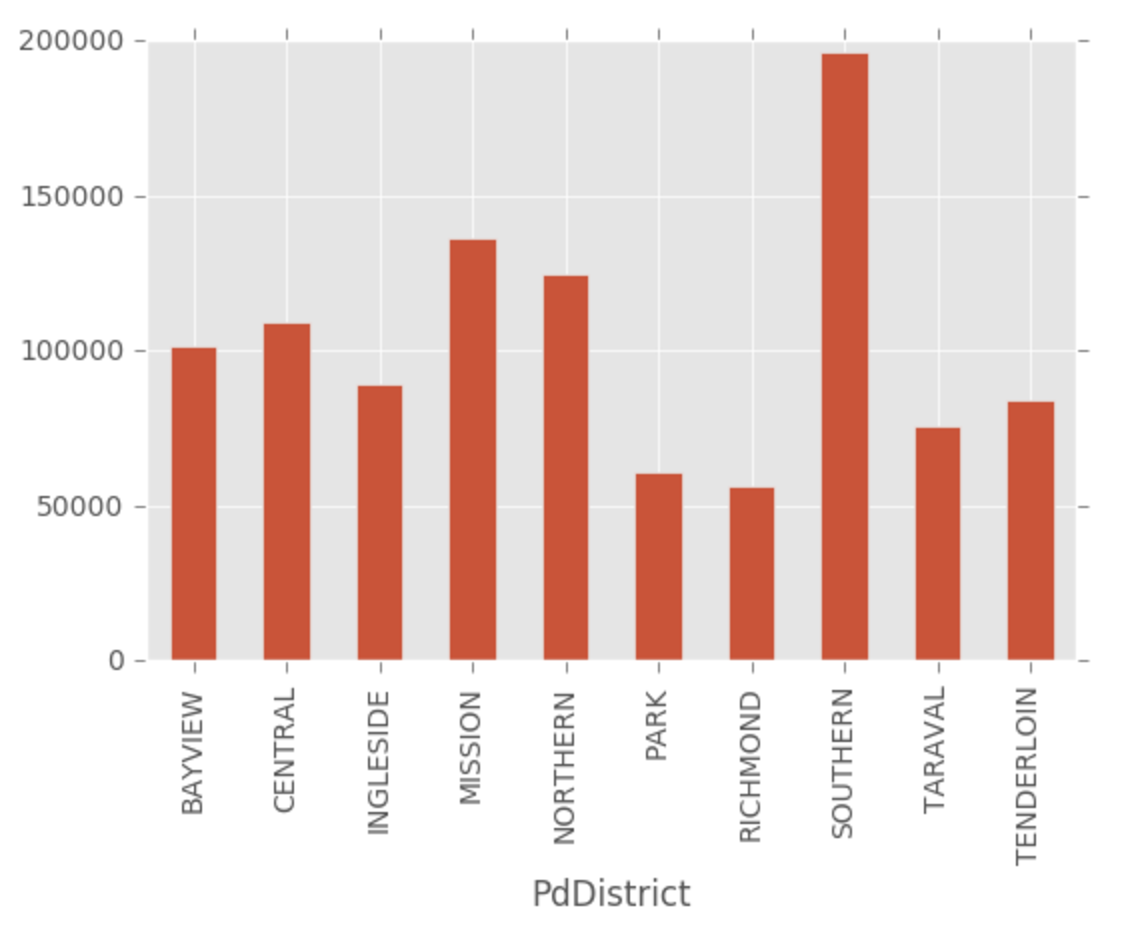
Dangerous Part in SF
To find out which part of San Francisco is most dangerous, I mapped a heatmap of the crime number. As the plot below show, Southern dstrict is the most dangerous place in SF. The crime number is almost 200000. Also, by using the barplot, the crime number in Southern district is much higher than other districts in SF.
ax, fig, bmap = draw_sf()

lons = list(Crime['Lon'])
lats = list(Crime['Lat'])
x,y = bmap(lons, lats)

db = 0.003 # bin padding
lon_bins = np.linspace(min(lons)-db, max(lons)+db, 10+1) # 10 bins
lat_bins = np.linspace(min(lats)-db, max(lats)+db, 13+1) # 13 bins

density, _, _ = np.histogram2d(lats, lons, [lat_bins, lon_bins])

# Turn the lon/lat of the bins into 2 dimensional arrays ready
# for conversion into projected coordinates
lon_bins_2d, lat_bins_2d = np.meshgrid(lon_bins, lat_bins)

# convert the bin mesh to map coordinates:
xs, ys = bmap(lon_bins_2d, lat_bins_2d) # will be plotted using pcolormesh

# define custom colormap, white -> nicered, #E6072A = RGB(0.9,0.03,0.16)
cdict = {'red':  ( (0.0,  1.0,  1.0),
                   (1.0,  0.9,  1.0) ),
         'green':( (0.0,  1.0,  1.0),
                   (1.0,  0.03, 0.0) ),
         'blue': ( (0.0,  1.0,  1.0),
                   (1.0,  0.16, 0.0) ) }
custom_map = LinearSegmentedColormap('custom_map', cdict)
plt.register_cmap(cmap=custom_map)

# add histogram squares and a corresponding colorbar to the map:
plt.pcolormesh(xs, ys, density, cmap="custom_map")

cbar = plt.colorbar(orientation='horizontal', shrink=0.625, aspect=20, fraction=0.2,pad=0.02)
cbar.set_label('Number of Crimes',size=18)
#plt.clim([0,100])


bmap.plot(x, y, 'o', markersize=1,#zorder=6,
          markerfacecolor='#424FA4',markeredgecolor="none", alpha=0.03)


# http://matplotlib.org/basemap/api/basemap_api.html#mpl_toolkits.basemap.Basemap.drawmapscale

plt.title('Distribution of Crimes in San Francisco')
plt.annotate('Southern', xy=bmap.SFFindNeighborhoods[21][1],
             color ='black',weight = 'black', size = 13, alpha =0.7)

plt.show()
Crime.groupby(['PdDistrict']).size().plot(kind = 'Bar')
Out[79]:
Dangerous Time in SF
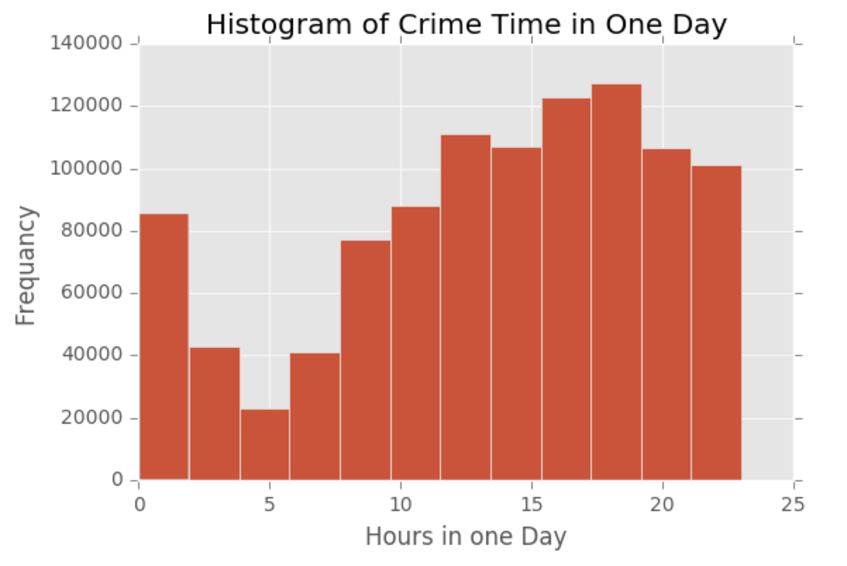
As for most dangerous time in SF, I ploted the histogram of crime case time. From the histogram, it is clear that the most dangerous time in a day is around 6pm. Crime case number starts to increase from 5am and increases until 18-19pm, then drops.
times = pd.DatetimeIndex(Crime.Datetime)
grouped = Crime.groupby([times.hour, times.minute])
plt.hist(times.hour, bins = 12)
plt.title('Histogram of Crime Time in One Day')
plt.xlabel('Hours in one Day')
plt.ylabel('Frequancy')
plt.show()
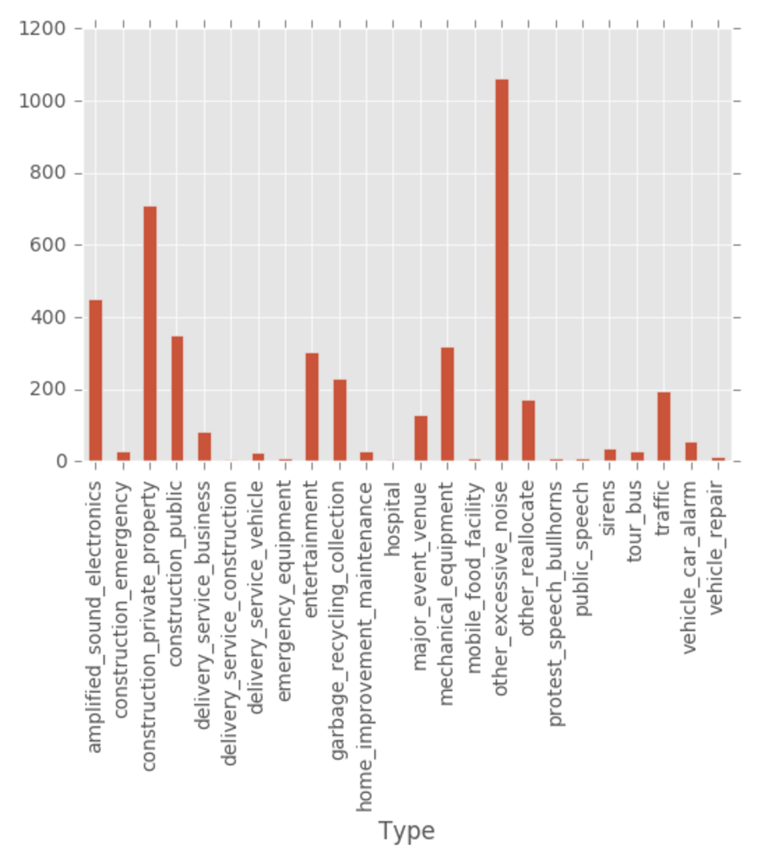
Question 2: Are noise complaints and mobile food vendors related?
Data Description and Processing
Two datasets The method of data processing and visualization is similar as described above. The datasets used in this part are noise and mobile_food_location. Noise contains caseID, Type, Address, Neighborhood, DateTime, Latitude and Longitude of each noise complaint case. Mobile_food_location contains locationid, LocationDescription, Address, Latitude and Longitude of each vendor.
Noise = pd.read_sql_query("select * from noise",conn0)
Noise = Noise.dropna()

Vendors = pd.read_sql_query("select * from mobile_food_locations",conn0)
Vendors = Vendors.dropna()
Data Visualization and Conlcusion
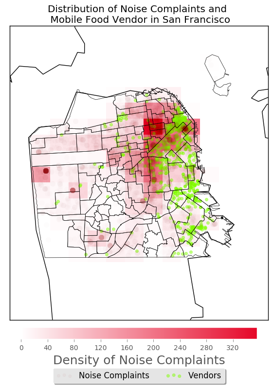
The noise complaints are not very much related with mobile food vendors. The barplot of noise complaints type shows that only few complaints is about mobile food vendors. Also, from the heatmap marking the noise number and vendors, we can see that the density of noise complaints are not very high associated with the distribution of vendors, especially in southern part of the city. Though in the areas where there are a lot of complaints, the number of vendors is large. However, it is not the opposite, in areas where there is a lot of vendors, the density of complaints are not always high. So the association between them is not very high.
ax, fig, bmap = draw_sf()

lons = list(Noise['Lon'])
lats = list(Noise['Lat'])
x,y = bmap(lons, lats) #for density


lons1 = list(Vendors['Longitude'])
lats1 = list(Vendors['Latitude'])
x1,y1 = bmap(lons1, lats1) #for points


db = 0.003 # bin padding
lon_bins = np.linspace(min(lons)-db, max(lons)+db, 10+1) # 10 bins
lat_bins = np.linspace(min(lats)-db, max(lats)+db, 13+1) # 13 bins

density, _, _ = np.histogram2d(lats, lons, [lat_bins, lon_bins])

# Turn the lon/lat of the bins into 2 dimensional arrays ready
# for conversion into projected coordinates
lon_bins_2d, lat_bins_2d = np.meshgrid(lon_bins, lat_bins)

# convert the bin mesh to map coordinates:
xs, ys = bmap(lon_bins_2d, lat_bins_2d) # will be plotted using pcolormesh
# ######################################################################

# define custom colormap, white -> nicered, #E6072A = RGB(0.9,0.03,0.16)
cdict = {'red':  ( (0.0,  1.0,  1.0),
                   (1.0,  0.9,  1.0) ),
         'green':( (0.0,  1.0,  1.0),
                   (1.0,  0.03, 0.0) ),
         'blue': ( (0.0,  1.0,  1.0),
                   (1.0,  0.16, 0.0) ) }
custom_map = LinearSegmentedColormap('custom_map', cdict)
plt.register_cmap(cmap=custom_map)


# add histogram squares and a corresponding colorbar to the map:
plt.pcolormesh(xs, ys, density, cmap="custom_map")

cbar = plt.colorbar(orientation='horizontal', shrink=0.625, aspect=20, fraction=0.2,pad=0.02)
cbar.set_label('Density of Noise Complaints',size=18)
#plt.clim([0,100])


# translucent blue scatter plot of epicenters above histogram:
#x,y = bmap(lons, lats)
bmap.plot(x, y, 'o', markersize=8,zorder=6, markerfacecolor='#990000',markeredgecolor="none", alpha=0.01)

# make image bigger:
#plt.gcf().set_size_inches(15,15)

# add 2 layers of scatter plot to the basemap by ggplot
plt.scatter(x[1], y[1], label = 'Noise Complaints',alpha = 0.5, color = '#990000')
plt.scatter(x1, y1, label = 'Vendors', alpha =0.5, color = '#80FF00')
plt.legend(loc='upper center', bbox_to_anchor=(0.5, -0.15),
          fancybox=True, shadow=True, ncol=5)
plt.title('Distribution of Noise Complaints and \n Mobile Food Vendor in San Francisco')
plt.show()
Noise.groupby(['Type']).size().plot(kind='Bar')